Why I made a flowchart canvas the main journey editor instead of a step list
In NxtForm I made a vertical flowchart the default way to build candidate journeys, with the old step list kept as a second view, because a list hides who goes where.
Context
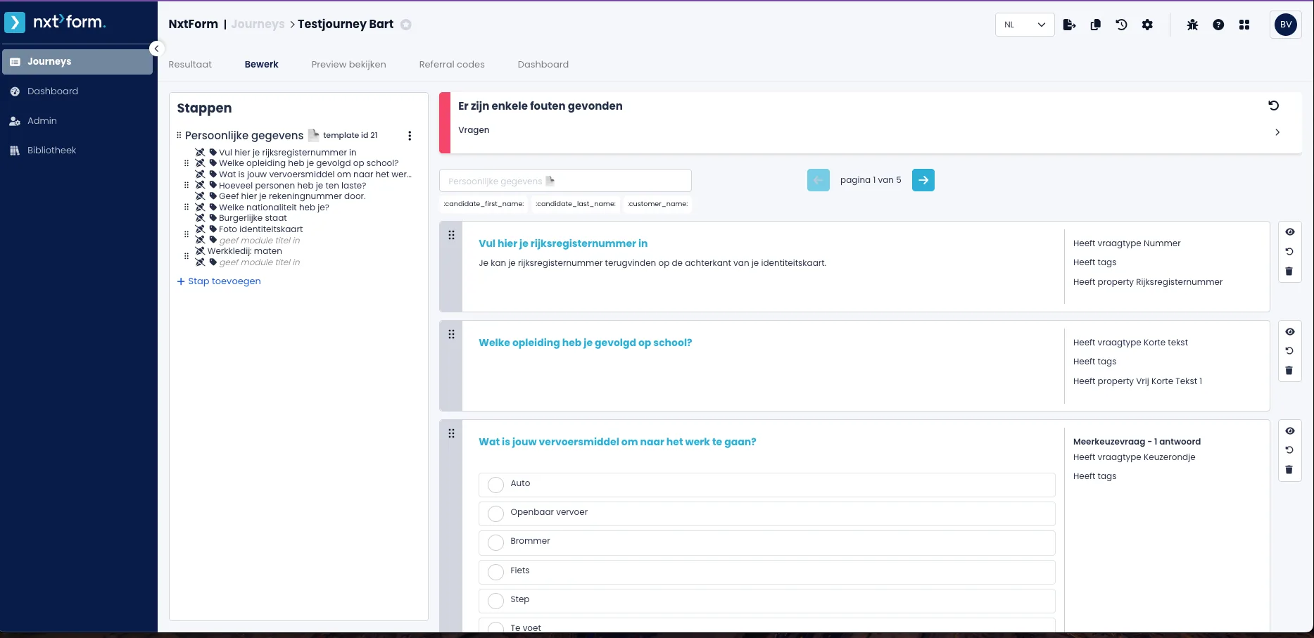
NxtForm is the module of NxtPeople, a multi-product HR SaaS platform, where recruiters build candidate journeys: question flows that candidates fill in to apply. The editor was a list of steps with question cards. Journeys are rarely straight: an answer can send a candidate to an extra step or end the application, through tags attached to answers. In the list, those routes were invisible.
Options considered
- Keep the step list and improve it: familiar and dense, and cheapest to build. Routes stay hidden in tag fields, so recruiters cannot check who goes where without reading every question.
- A document-style editor with inline “when / then” rules, as Tally does: fast to type in, but branching still reads top to bottom, and drop-outs are easy to miss.
- A flowchart canvas as the main view, with the list kept as a second view of the same journey: shows structure and routes directly, but it is the most expensive part of the build and needs layout rules so it does not turn into spaghetti.
Decision
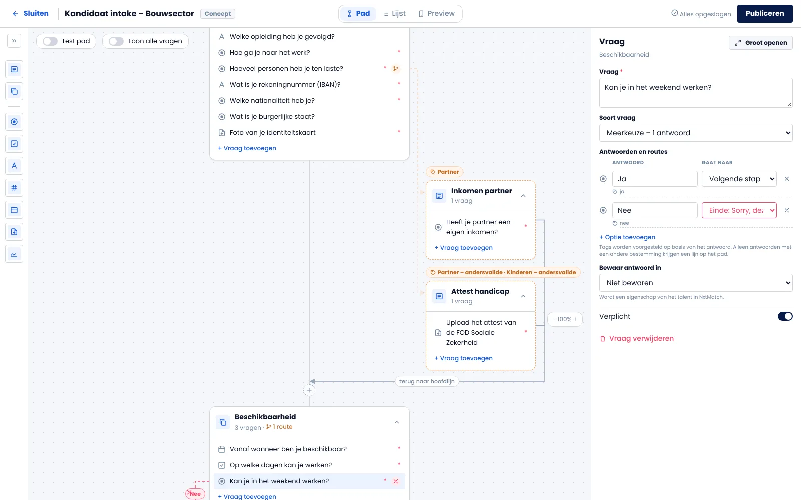
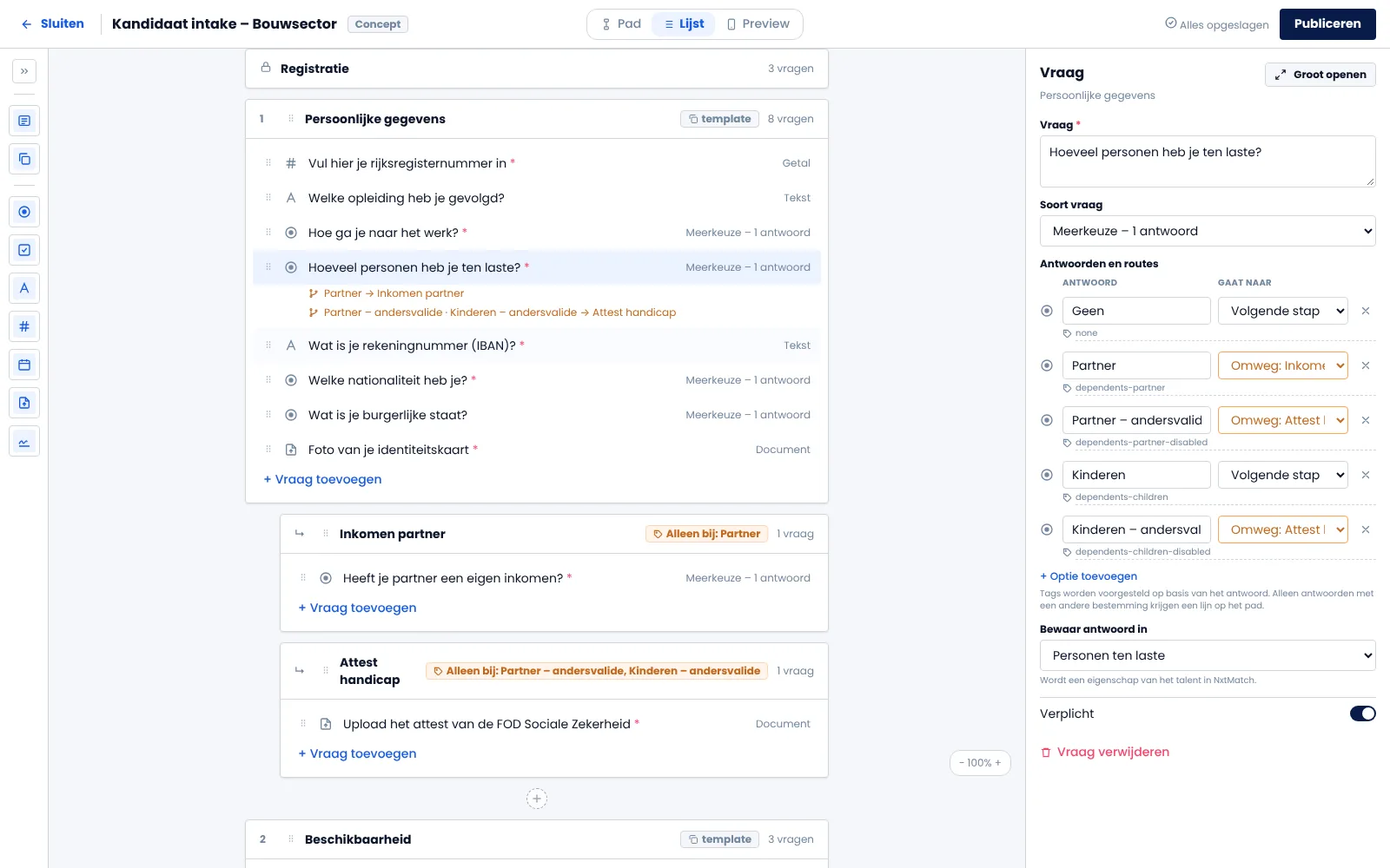
I chose the flowchart, called “Path”, as the default, and kept the list as “List”. Both edit the same journey and share the same detail panel on the right, so switching views changes how you look, not what you can do. This follows Typeform, which lets you build in a list and see logic on a map.
I set four rules to keep the canvas readable:
- The path runs top to bottom, so a straight journey still reads like a list.
- Only answers that change the route get a line. Tags that only store data draw nothing.
- There are two kinds of route. A detour (orange) sits in a side lane and returns to the main line. A drop-out (red) runs to the “Sorry” ending.
- Labels show the answer text, never the technical tag.
Routes are set in the panel with a “Goes to” dropdown per answer, not by dragging lines. Most recruiters are not comfortable drawing logic on a canvas, but everyone can use a dropdown. A “Test path” switch lets you pick answers like a candidate and lights up that one path.
Outcome
Too early to measure. The canvas exists as a clickable prototype and a build brief, and still needs sign-off from the senior design authority. Two signals will show whether it was worth the cost: how many journeys use routes at all, and whether recruiters stay in Path or switch back to List.
What I’d do differently
I would pull the routing data before designing the canvas, not after. If most journeys turn out to be straight lines, the list should be the default and the canvas the extra. I would also check earlier whether routes are stored on the question or on the step, because the panel design depends on it.