Why I made editing a separate workspace instead of a tab
In NxtForm I moved journey editing out of the tab bar into its own workspace with a clear entry and exit, because a tab hides that you are changing something candidates use.
Context
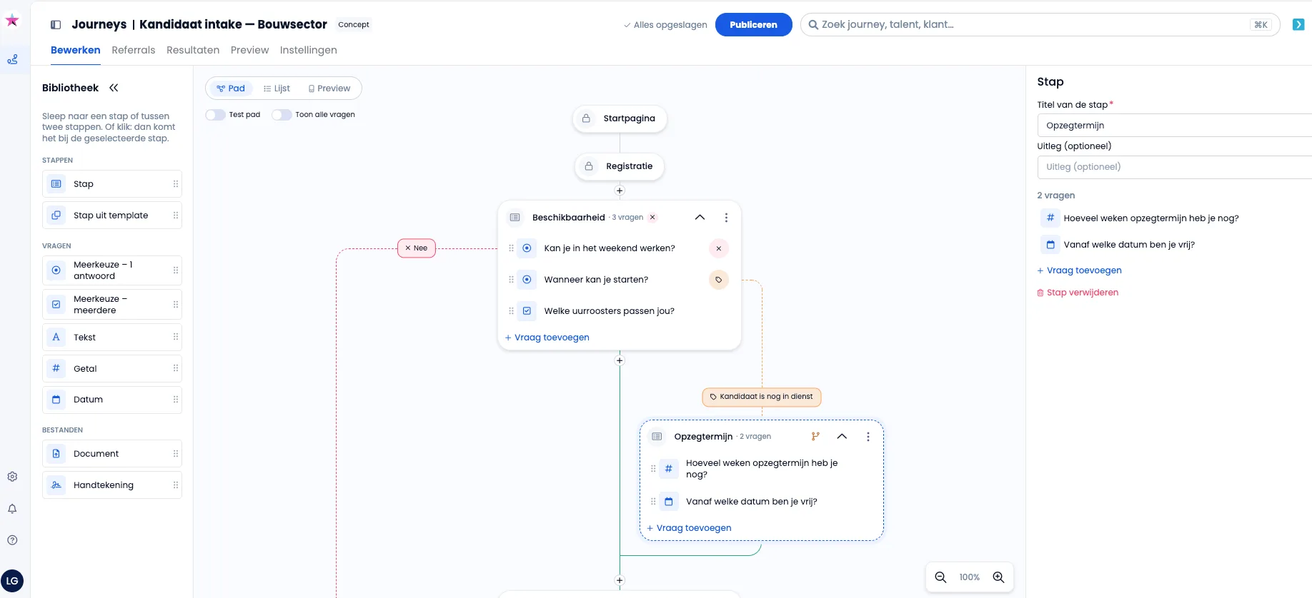
NxtForm lets recruiters at NxtPeople, a multi-product HR SaaS platform, build candidate journeys: question flows that candidates fill in to apply. In the new visual editor, “Bewerken” (Edit) was one tab next to Referrals, Results, Preview and Settings. Those other tabs show a journey; Edit changes it, and a journey can already be live with candidates filling it in. Editing a live journey is rare, but it happens.
Options considered
- Keep Edit as a tab and add a banner: cheapest to build, but a banner is a warning, not a place. Users stop reading a banner that is always there.
- Keep Edit as a tab, rely on autosave: no extra click, but nothing distinguishes looking at a journey from changing it.
- Make editing a separate workspace: one extra click to start editing, and the module navigation disappears while you edit.
Decision
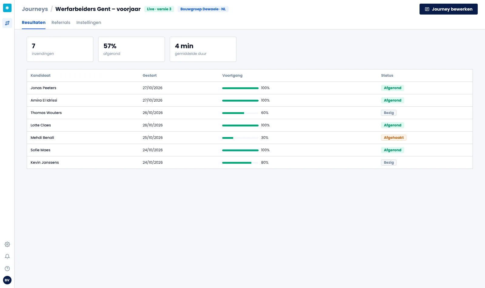
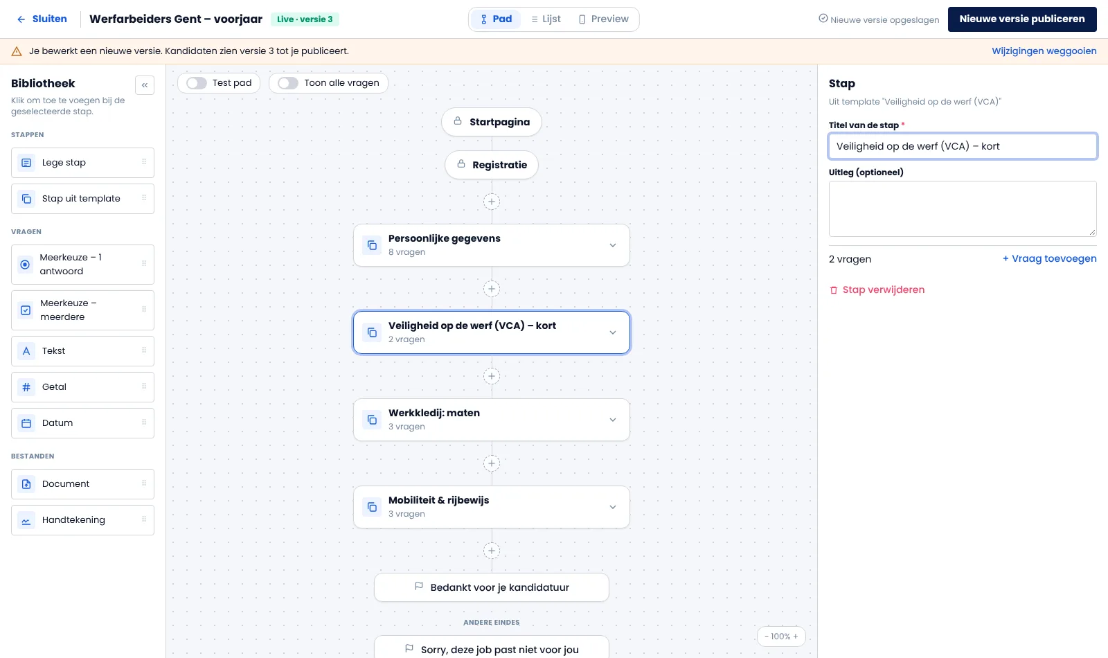
I made editing a separate workspace, the pattern HubSpot uses for forms and Shopify for themes. A journey now opens on Results. Its tabs are Results, Referrals and Settings, and a primary button “Edit journey” starts editing. The workspace replaces the app chrome with its own bar: “Close” and the journey name on the left, the Path / List / Preview switch in the middle, save status and “Publish” on the right. Preview moved out of the tabs into that switch, because it belongs to editing.
A new journey skips Results and opens straight in the workspace, because there is nothing to show yet.
I still use a banner, but only where it carries real risk. When you edit a live journey, you work in a new draft version, and a thin orange strip says: “Candidates see version 3 until you publish.” Draft journeys get no strip, so the strip keeps its meaning. The publish button becomes “Publish new version” and stays disabled until something changes. “Discard changes” asks for confirmation, because it cannot be undone.
The trade-off is one extra click for every edit. I accepted that because recruiters open existing journeys mostly to check results, and editing a live journey is the moment a mistake reaches candidates.
Outcome
Too early to measure. The decision is in a clickable prototype and a build brief for the next release, and it still needs sign-off from the senior design authority. Two signals will show whether it works: whether Results is the tab people open most on existing journeys, and how often live journeys get edited and published without support questions.
What I’d do differently
I would check the versioning model before designing the live-journey state. Draft and live versions only exist for clients with the “Journey reviewing” add-on, so the behaviour for all other clients is still an open question. I also hid the module navigation inside the workspace for focus. I would test that with recruiters before treating it as settled.