The challenge.
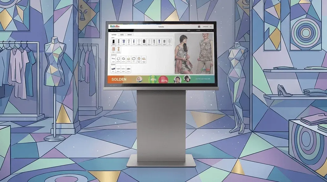
Customers were familiar with online shopping on their own devices, but using similar tools inside a physical store was less familiar. The kiosk needed to make that transition intuitive.
The key decision.
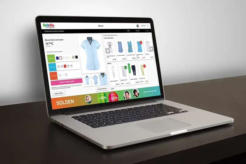
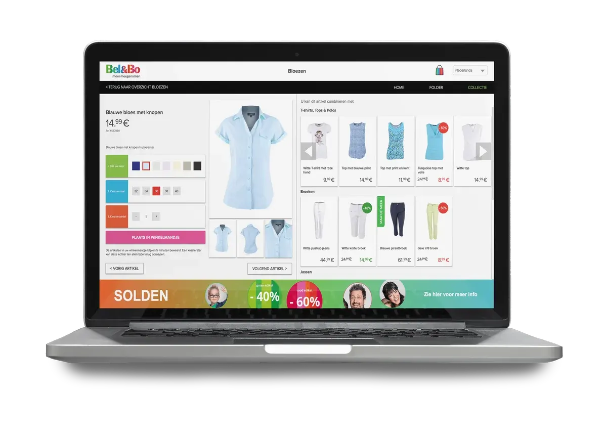
We based the experience on Bel&Bo’s existing website, adding contextual features for the retail environment. Input from the team and customers shaped the interface.
The rejected option & why.
A direct website copy alone would not address the in-store context. The interface retained familiar patterns while adapting the experience to large interactive monitors.
The outcome.
The kiosk interface allowed shoppers to search products, explore available sizes and colours, and check stock availability across locations.
The final verdict.
The work connected digital product discovery with the store environment. Familiar website patterns and contextual features helped make the kiosk approachable for shoppers.